
How to Prepare Figures and Tables That Editors Can Read Quickly
In scholarly publishing, figures and tables are not decorative elements they are core vehicles of scientific communication. Editors and reviewers often rely on them for a rapid assessment of a manuscript’s quality, clarity, and contribution. Poorly designed visuals can lead to confusion, delays, or even desk rejection, while clear and well-structured figures and tables can significantly enhance the evaluation process.
At Crosslink Studies (CLS), we emphasize the importance of presenting data in a way that is clear, concise, and immediately interpretable. Well-prepared visuals not only improve editorial efficiency but also increase the overall impact of your research.
Why Visual Clarity Matters
Editors typically conduct an initial screening under time constraints. During this stage, figures and tables serve as a quick summary of your findings.
Effective visuals communicate key results at a glance, support the manuscript’s core arguments, reflect the rigor and professionalism of the research. Clear visuals can often determine whether a manuscript proceeds to peer review.
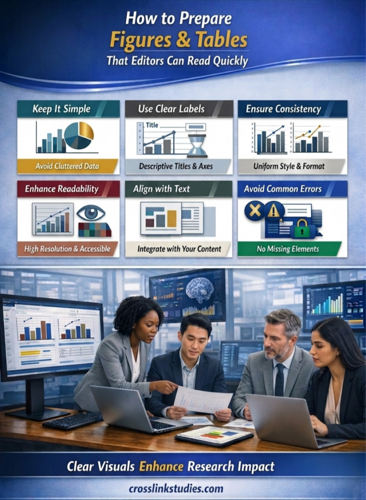
Keep It Simple and Focused
Complex, cluttered visuals are difficult to interpret. Each figure or table should communicate one main idea.
Best practices:
- Avoid overcrowding with excessive data
- Use clean layouts and logical structure
- Limit the number of variables shown at once
A simple figure is more powerful than a complex one that requires interpretation.
Use Clear Labels and Descriptive Titles
Editors should not have to search the text to understand your visuals. Ensure that every figure and table has a concise, descriptive title, axes, units, and variables are clearly labeled, abbreviations are defined either in the caption or notes. Clarity in labeling ensures that visuals are self-contained and understandable.
Maintain Consistency Across the Manuscript
Consistency reflects professionalism and improves readability. Apply uniformity in font style and size, color schemes and symbols, terminology and units.
Optimize for Readability and Accessibility
Figures and tables should be easy to read both on screen and in print. Readable visuals improve both editorial review and reader engagement.
Key considerations:
- Use high-resolution images
- Ensure text is legible at reduced sizes
- Avoid overly bright or distracting colours
- Use colour-blind-friendly palettes where possible
Align Figures and Tables with the Narrative
Visuals should complement not repeat or contradict the main text. Effective integration include reference each figure, table clearly in the text, highlight key findings without duplicating full data, ensure consistency between textual claims and visual evidence. A strong alignment reinforces the credibility of your research.
Follow Journal Guidelines Strictly
Each journal, including CLS, provides specific formatting requirements for figures and tables. Authors should adhere to file formats and resolution standards, follow caption and numbering conventions, ensure compliance with submission guidelines. Failure to follow guidelines can result in unnecessary revisions or delays.
Common Mistakes to Avoid
Avoid these frequent issues that hinder editorial readability:
❌ Overly complex or crowded visuals
❌ Missing labels or unclear legends
❌ Inconsistent formatting
❌ Low-resolution or pixelated images
❌ Redundant tables that repeat text
Eliminating these errors enhances both efficiency and professionalism.
The CLS Approach to Effective Visual Communication
At Crosslink Studies, we prioritize clarity and accessibility in research presentation. Authors are encouraged to design figures and tables that:
- Enable quick editorial assessment
- Communicate findings efficiently and accurately
- Meet international publishing standards
By doing so, authors improve not only their chances of acceptance but also the impact and reach of their work.